My good friend and fellow mentor, Ken Chow, developed a trading technique he calls SuperStructure. It uses only price. No indicators at all. He and his students do quite well.
But, success at SuperStructure requires a certain mathematical aptitude that not everyone has. I know I don’t have it.
I need more visual cues than I can get from price alone. Hence, the indicators on my charts.
Why do we use indicators? What do they really do? Two important things:
1. They give us a point of reference to which price movement can be compared, and
2. They create a filter that eliminates the “static and noise” that are irrelevant to showing the true direction of price.
I believe that in order to be effective, indicators must be correlated with the movement of the price so that they reiterate that movement but in a different visual style. So, wherever one’s eyes fall on the chart, one sees a depiction of price movement.
I create this correlation through the use of a color-coding scheme based upon Red, White & Blue. I use these colors because they provide a nice visual contrast, and because, thanks to John Phillip Sousa, everyone in this country always tends to think of those three colors in that specific order: Red, White & Blue.
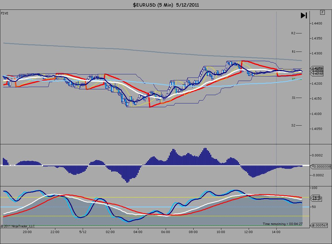
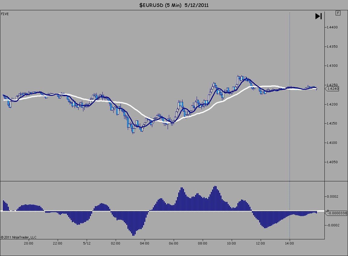
Chart #1 is a sample of a five minute chart that I use to day trade the S&P Emini (ES) and my favorite forex pair, EUR/USD. Chart #2 shows just the White and Blue moving averages and the White and Blue MACD to illustrate the relationship between these elements. Chart #3 adds the White and Blue Stochastic lines. Chart #4 combines the Red and White elements including the Parabolic SAR I use to create “Momentum Modules.”. And finally, Chart #5 adds back the White and Blue to complete the correlation.
Please click on the charts below to make them full screen.